Flutter: Animated AppBar! Part — 1
In this series, we’ll be making a cool-looking AppBar. Which would look something like this

We start with creating a simple SliverList for our placeholder data.
This should be how our build method should look like:
Widget build(BuildContext context) {
  return Container(
    color: Colors.white,
    child: CustomScrollView(
      slivers: [
        SliverList(
          delegate: SliverChildBuilderDelegate(
            (context, index) {
              return Container(
                margin: const EdgeInsets.all(8),
                height: 40,
                color: Colors.grey,
              );
            },
            childCount: 40,
          ),
        ),
      ],
    ),
  );
}
You’ll see an ugly screen like this one.

Now, add a SliverPersistentHeader to the CustomScrollView we just made:
CustomScrollView(
  slivers: [
    SliverPersistentHeader(
      pinned: true,
      floating: false,
    ),
    SliverList(...),
  ],
),
You’ll get an error that says The named parameter ‘delegate’ is required, but there’s no corresponding argument.
For that we need to create a SliverPersistentHeaderDelegate first don’t get nervous it’s just a big word.
Create a class that extends SliverPersistentHeaderDelegate and override the required methods.
class AppBarDelegate extends SliverPersistentHeaderDelegate {
  @override
  Widget build(BuildContext context, double shrinkOffset, bool overlapsContent) {
    // TODO: implement build
    throw UnimplementedError();
  }

  @override
  // TODO: implement maxExtent
  double get maxExtent => throw UnimplementedError();

  @override
  // TODO: implement minExtent
  double get minExtent => throw UnimplementedError();

  @override
  bool shouldRebuild(covariant SliverPersistentHeaderDelegate oldDelegate) {
    // TODO: implement shouldRebuild
    throw UnimplementedError();
  }
}
We need to write the implementation of these 4 methods before using this delegate in our SliverPersistentHeader.
For now, we add some placeholder code here. We’ll play with these later.
@override
Widget build(
    BuildContext context, double shrinkOffset, bool overlapsContent) {
  return Container(
    height: maxExtent,
    color: Colors.red,
  );
}

@override
double get maxExtent => 100;

@override
double get minExtent => 50;

@override
bool shouldRebuild(covariant SliverPersistentHeaderDelegate oldDelegate) {
  return false;
}
We’re ready to provide this delegate to the SliverPersistentHeader.
SliverPersistentHeader(
pinned: true,
floating: false,
delegate: AppBarDelegate(),
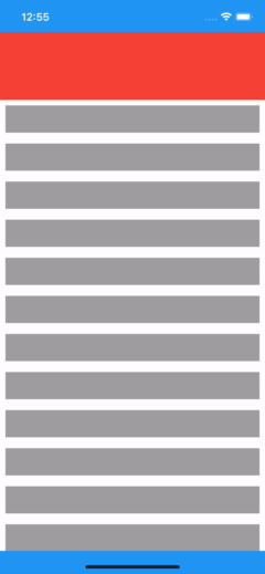
),We can see the header, but it is leaking behind the status bar.

I know it looks fine now, but this will cause problems later so, let’s fix this with some workarounds
@override
Widget build(BuildContext context) {
  return Material(
    color: Colors.blue,
    child: SafeArea(
      child: Container(
        color: Colors.white,
        child: CustomScrollView(
          slivers: [
            SliverPersistentHeader(
              pinned: true,
              floating: false,
              delegate: AppBarDelegate(),
            ),
            SliverList(
              delegate: SliverChildBuilderDelegate(
                    (context, index) {
                  return Container(
                    margin: const EdgeInsets.all(8),
                    height: 40,
                    color: Colors.grey,
                  );
                },
                childCount: 20,
              ),
            )
          ],
        ),
      ),
    ),
  );
}
This is what it should look like now!

Better!
Now for the main act! We’ll try to understand SliverPersistentHeaderDelegate.
Let us start with understanding a few things:
- The build method is called every time we scroll.
- maxExtent: The maximum size of our header, when it is completely expanded.
- maxExtent: The minimum size of our header, when it is completely collapsed.
- shrinkOffset: The current amount by which the sliver has been shrunk. So, its value ranges from 0(when it is completely collapsed) to maxExtent (when it is completely expanded).
So at any moment if we had to know the AppBar height, it can be determined by
if: maxExtent - shrinkOffset > minExtent // partially collapsed
   appBarHeight = maxExtent - shrinkOffset
else: //fully collapsed
   appBarHeight = minExtent
let’s put this logic into our delegate
import 'package:flutter/material.dart';

class AppBarDelegate extends SliverPersistentHeaderDelegate {
  @override
  double get maxExtent => 100;

  @override
  double get minExtent => 50;

  double getCurrentHeight(shrinkOffset) => maxExtent - shrinkOffset;

  double getAppBarHeight(double shrinkOffset) {
    final currentHeight = getCurrentHeight(shrinkOffset);
    return currentHeight > minExtent ? currentHeight : minExtent;
  }

  @override
  Widget build(
      BuildContext context, double shrinkOffset, bool overlapsContent) {
    return Container(
      height: getAppBarHeight(shrinkOffset),
      color: Colors.red,
    );
  }

  @override
  bool shouldRebuild(covariant SliverPersistentHeaderDelegate oldDelegate) {
    return false;
  }
}
We’ve got ourselves an expanding AppBar!
Let’s make this a little bit better and divide our AppBar into two sections, with one hiding behind the other.
@override
Widget build(
    BuildContext context, double shrinkOffset, bool overlapsContent) {
  return Column(
    mainAxisSize: MainAxisSize.min,
    children: [
      Material(
        elevation: 8,
        color: Colors.red,
        child: Container(
          height: minExtent,
        ),
      ),
      Container(
        height: getAppBarHeight(shrinkOffset) - minExtent,
        color: Colors.blue,
      ),
    ],
  );
}
Viola! A piece of art!
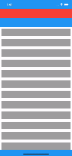
I know this can be achieved by using flexibleSpace in SliverAppBar.

