Flutter: Animated AppBar! Part — 2
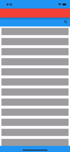
Last time we made this not-so-awesome UI. Link to Part — 1

We’ll change this to something awesome now
We start with our previous SliverPersistentHeaderDelegate
import 'package:flutter/material.dart';

class AppBarDelegate extends SliverPersistentHeaderDelegate {
  @override
  double get maxExtent => 100;

  @override
  double get minExtent => 50;

  double getCurrentHeight(shrinkOffset) => maxExtent - shrinkOffset;

  double getAppBarHeight(double shrinkOffset) {
    final currentHeight = getCurrentHeight(shrinkOffset);
    return currentHeight > minExtent ? currentHeight : minExtent;
  }

  @override
  Widget build(
      BuildContext context, double shrinkOffset, bool overlapsContent) {
    return Column(
      mainAxisSize: MainAxisSize.min,
      children: [
        Material(
          elevation: 8,
          color: Colors.red,
          child: Container(
            height: minExtent,
          ),
        ),
        Container(
          height: getAppBarHeight(shrinkOffset) - minExtent,
          color: Colors.blue,
        ),
      ],
    );
  }

  @override
  bool shouldRebuild(covariant SliverPersistentHeaderDelegate oldDelegate) {
    return false;
  }
}
Here the blue container is actually shrinking and not moving behind the red material widget. To move one below the other we have to use Stack, Let’s begin!
Widget build(
    BuildContext context, double shrinkOffset, bool overlapsContent) {
  return SizedBox(
    height: getAppBarHeight(shrinkOffset),
    child: Stack(
      children: [
        Positioned(
          top: minExtent,
          bottom: 0,
          left: 0,
          right: 0,
          child: Container(
            height: maxExtent - minExtent,
            color: Colors.blue,
          ),
        ),
        Material(
          elevation: 8,
          color: Colors.red,
          child: Container(
            height: minExtent,
          ),
        ),
      ],
    ),
  );
}
The result will be the same as last time, but the blue container is moving behind the red material widget this time.
Now we add a helper function that will give us the ratio from 1 to 0. This function tells us how much the AppBar is expanded, 1 being fully expanded and 0 being fully collapsed. This will help us determine dynamic padding, positioning, and size depending on the current state of the AppBar.
double getShrinkRatio(shrinkOffset) =>
    getCurrentHeight(shrinkOffset) / maxExtent;
Let’s add a search icon to make it look cooler
@override
Widget build(
BuildContext context, double shrinkOffset, bool overlapsContent) {
return SizedBox(
height: getAppBarHeight(shrinkOffset),
child: Stack(
children: [
Positioned(
top: minExtent,
bottom: 0,
left: 0,
right: 0,
child: Container(
height: maxExtent - minExtent,
color: Colors.blue,
),
),
Material(
elevation: 8,
color: Colors.red,
child: Container(
height: minExtent,
),
),
Positioned(
top: minExtent * getShrinkRatio(shrinkOffset),
bottom: 0,
left: 0,
right: 0,
child: SizedBox(
height: maxExtent - minExtent,
// color: Colors.green,
child: Row(
mainAxisAlignment: MainAxisAlignment.end,
children: const [
Icon(Icons.search),
SizedBox(width: 12),
],
),
),
),
],
),
);
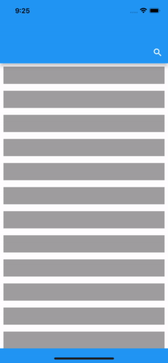
}Awesome! Look at this beauty!
Let’s adjust the color and styling, remove the debug color and make the AppBar blue.
@override
Widget build(
    BuildContext context, double shrinkOffset, bool overlapsContent) {
  return Material(
    color: Colors.blue,
    elevation: 8,
    child: SizedBox(
      height: getAppBarHeight(shrinkOffset),
      child: Stack(
        children: [
          Positioned(
            top: minExtent,
            bottom: 0,
            left: 0,
            right: 0,
            child: Container(
              height: maxExtent - minExtent,
            ),
          ),
          Container(
            height: minExtent,
          ),
          Positioned(
            top: minExtent * getShrinkRatio(shrinkOffset),
            bottom: 0,
            right: 0,
            child: Container(
              height: maxExtent - minExtent,
              padding: const EdgeInsets.only(right: 12),
              child: const Icon(
                Icons.search,
                color: Colors.white,
              ),
            ),
          ),
        ],
      ),
    ),
  );
}
Well, now it looks achievable without all this messy code, right?
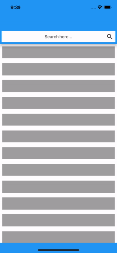
Wait! We’re gonna make it awesome again, you see we left two containers at the beginning of the stack, we’re gonna use the first one to make it look like a search bar.
@override
Widget build(
    BuildContext context, double shrinkOffset, bool overlapsContent) {
  return Material(
    color: Colors.blue,
    elevation: 8,
    child: SizedBox(
      height: getAppBarHeight(shrinkOffset),
      child: Stack(
        children: [
          Positioned(
            top: minExtent,
            bottom: 0,
            left: 0,
            right: 0,
            child: Container(
              margin: const EdgeInsets.all(6),
              height: maxExtent - minExtent,
              alignment: Alignment.center,
              color: Colors.white,
              child: const Text('Search here...'),
            ),
          ),
          Container(
            height: minExtent,
            //TODO: we have plans for this
          ),
          Positioned(
            top: minExtent * getShrinkRatio(shrinkOffset),
            bottom: 0,
            right: 0,
            child: Container(
              height: maxExtent - minExtent,
              padding: const EdgeInsets.only(right: 12),
              child: const Icon(
                Icons.search,
              ),
            ),
          ),
        ],
      ),
    ),
  );
}
And here it is!
Stay tuned for the final part where we use the second container and make this even better!

